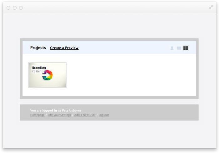
With interface design, you'll rarely ever hit the nail on the head the first time around — it's an iterative process. You launch with what works best, and you continually improve on it... piece by piece. I was reminded of this recently when I came across an old screenshot of the app from 2009:
And here's that same screen today:
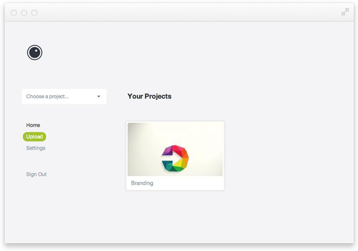
On the face of it, there's really not much difference — a change of background, a new logo and a couple less 'things' on the page. But for me, it's those small changes that make the big difference; 4 years of constant design iteration has led to a point where your images are the focal point, and all clutter has been stripped back.
A reminder that with some things, it can take 100 revisions to create an interface that looks so simple, you're left wondering why it took so many attempts to get there. Yet without the 100 preceding designs (and the 100 lessons learned), that screen wouldn't look anywhere near what it does today.
Write a comment