As designers, we tend to make the valid assumption that everything we produce will be viewed on a mobile device, so invest the time to design/build accordingly. That was certainly the case with Prevue, which displays a dedicated mobile app when viewed on a phone. Until now.
By 'now', I mean three months ago — which is when I pulled the mobile version of the app completely, as part of this release. And in the 100+ days since, not a single person has mentioned the loss.
That's not to say it hasn't been noticed, but it's certainly a good indicator that the mobile app wasn't the significant feature I'd originally thought. On reflection, it was originally a project undertaken simply because it seemed like the right thing to do at the time (everyone has mobile apps, right?). But after crunching the numbers of a years' worth of use, it transpired that only 0.2% of visitors logged in using a mobile device.
Horses for courses
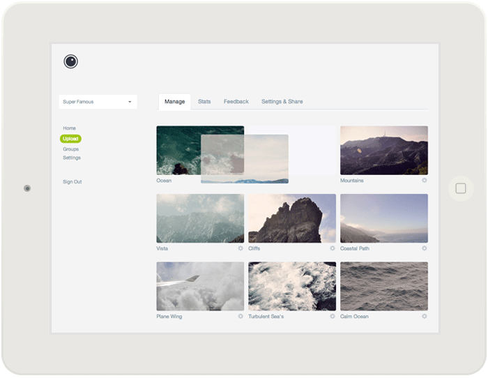
Quite simply, Prevue is a desktop tool — it's used by designers and agencies to upload files from where they work. It's a tool that's deeply embedded in a studio-based, desktop workflow... and definitely not a mobile product. If only I'd taken the time to research product and browser usage before following the mobile trend, I'd have avoided learning the hard way.
Focus.
As with most tough decisions on Prevue, this was remedied by utilising data. Instead of simply 'switching off' the mobile view, I got stuck into researching device usage - specifically learning about how and when customers were using anything other than a desktop. Through that research, I found that whilst mobile usage of the app was low, there were two stand-out occasions where that wasn't the case; when projects are shared with clients, and when the app is used in presentations.
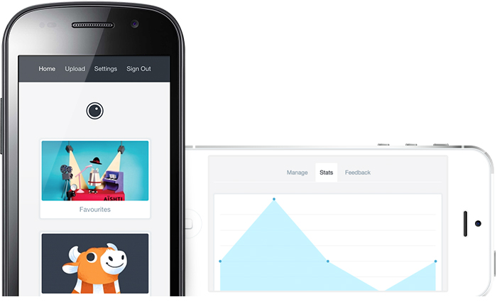
Firstly, I found that projects and groups were commonly first opened on mobile — presumably when a designer emails their project link to a client. So instead of showing a zoomed-out (and tiny) version of projects in those occasions, it made sense to have a responsive layout on that particular page - making your work look its best at any size.
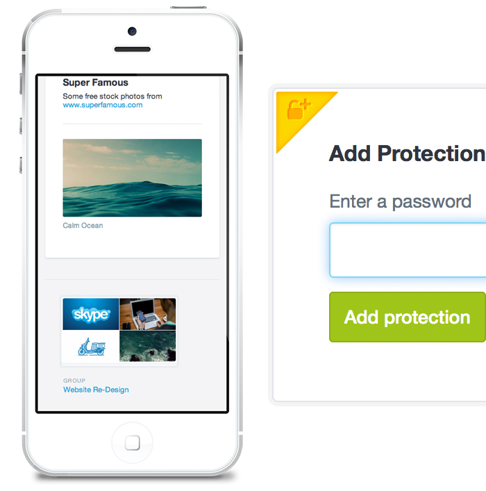
Secondly, I found that a large chunk of people use iPads to access their work during presentations and client meetings, specifically to manage projects (reorder, rename, delete etc). So instead of completely changing the layout of the app for those people, I simply built in touch gestures like drag and drop — bringing native desktop functionality to the tablet. Coupled with a retina-ready interface (above), such a seemingly small touch made a significant difference in feel and familiarity.
Then the rest of the app, since it's rarely used by mobile devices, simply falls back to its desktop version - still fully functional on a phone or tablet, but with no specific responsive styling. Doing so has allowed me to focus on creating better desktop experiences (watch this space), and test the app in a wider suite of desktop clients (IE7 and above).
A cautionary tale
Designers; Research whether your users need you to make your site/product responsive before jumping on the bandwagon. By focussing on the needs and habits of your customers, you might just save yourself a lot of time and effort.
Write a comment