As a product owner, my main interest is in the happiness of the people using my product. Given a spare hour, I'd rather work on improving experience than forcing users to part with cash. I'd far rather see 1000 happy customers than an extra $1,000 profit.
But as idealistic as that sounds, it's just not a sustainable business model. It doesn't take an accountant to figure out that as a user base grows, so too do operational costs. So in mid-2013, faced with the prospect of financially flat-lining, I started exploring ways to improve conversions in Prevue without changing the "feel" of the product, or by selling out my users.
Prevue exists to make designers' professional lives easier - I consider anything that gets in the way of that motive as unnecessary noise. So improving conversions by using tricky sales tactics or forcing workflows wasn't going to work for me... so instead, I did the opposite. I listened to the people who use the product the most, I invested time into building features, I completely removed annoying ads, I increased limits and gave paid features to everyone.
As a result conversions have increased by 120%, and engagement by 4x
In this 2-parter (jump to part 2), I'll explain how I did that without losing the spirit of my product, or compromising my core values. Specifically, how I went about finding opportunities within my product, and how I decided on what to improve:
Problem #1:
The unknown audience
Prevue, like most products, sees a variety of users; from high volume uploaders to one-hit wonders, yet I had no real insight into what audience was most profitable. As with anything, there are some people who are very likely to pay for a product they find useful, and others who won't. I had no idea who was who. Instead, prompts to upgrade weren't shown to the right people at the right time - they were shown to everyone, but used by few.
Instead of guessing, I used data to give me the answers. Specifically, I used 5 years of historical data to analyse exactly how people use the product during their lifecycle. I broke my analysis down into 3 parts:
- Mapping the usage habits of the most active 10% of users
- Mapping paths taken by the people who paid for accounts - but specifically the paths they took before they made the conversion
- The account usage of brand new customers who later went on to sustain active accounts
As you might suspect, the data proved that engagement is the key — the more images a person uploaded, the more likely they were to convert at a later date. Interestingly, the data showed that once a person uploaded at least 8 images - they'd typically continue to upload more images over time (as opposed to abandoning their account). Similarly when that person reached around 25 lifetime uploads, they'd be most likely to consider paying for the service.
Uploading 8 images creates an engaged user. Over 25 images and they're likely to upgrade.
The solution(s)
The numbers made it clear; I needed to improve engagement by encouraging people to upload more images. I immediately set about doing that in a few ways:
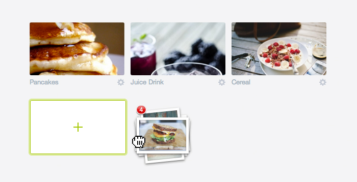
- Feature improvement. Given that I wanted people to upload images, it became painfully clear that the act of uploading was far too complicated - getting an image in your account typically involved uploading one at a time; a slow and lengthy process. So I invested time building a brand new drag & drop interface which allowed users to upload up to 15 images at once, and at lightning speeds.
The result? The number of uploads doubled almost instantly, and has continued to grow month-over-month since.
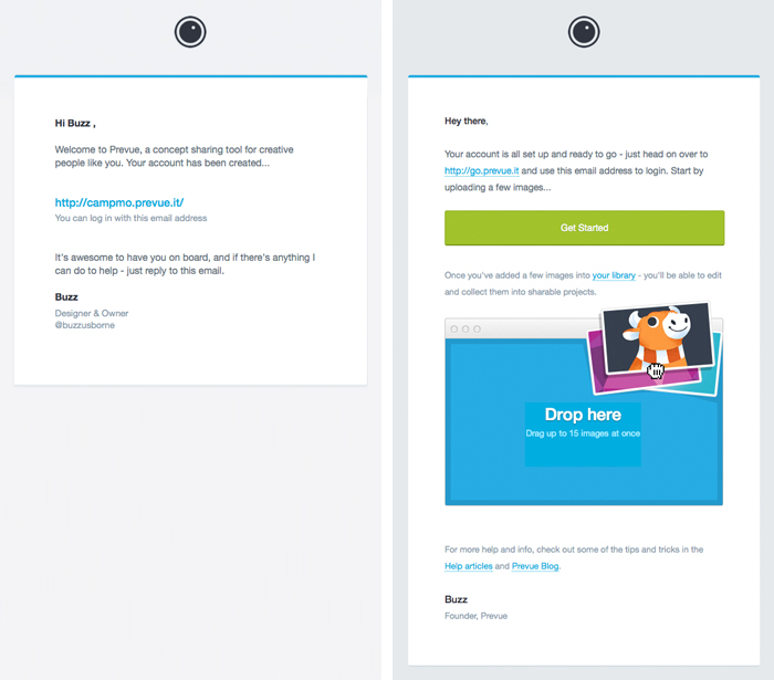
- Email reminders. When someone created a new account they received a welcome email containing some basic login information... but nothing more. Given that open rate for that email was around 60%, it seemed like a missed opportunity to encourage account use. So the content and call-to-action on all welcome emails changed to focus on uploading images. Similarly, low-activity accounts were sent a follow-up email if they hadn't uploaded anything after a week.
The result? New accounts (less than 10 days old) went from containing an average of 0.2 images, to containing 4.5 images each when combined with bulk upload — over 180% increase.
The welcome email - before and after:
- Key activities. When running the numbers, there appeared to be a strong correlation between some key activities — such as creating projects, or uploading a logo, and account retention. The more invested a person became in the customisation and organisation of their content, the more likely they'd be to remain engaged, or even upgrade. So much like the work that went into uploading, I focussed on improving and promoting organisational tasks (like creating projects).
The result? Through minor tweaks and improvements to existing functionality, project management went from around 1,000 items of recorded activity per week, to around 13,000 - and there it's stayed.
Problem #2:
A confusing product offering
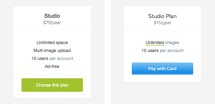
Last year, upgrading to a paid account gave you access to advanced features, more space, no adverts, and various other tidbits via the choice of either a Freelance or Studio plan. However, instead of being enticing, people were presented with a choice overload - there was no single clear reason to upgrade.
A solution
Give a clear reason to upgrade. It was a difficult choice to make, but I decided to trust the numbers and my findings from above - and centre the product around images rather than features. According to the stats, people upgraded because of image space, and rarely anything else.
So I gave advanced features to everyone* and removed adverts entirely. Now the product offering was simple, you upgraded for more image space, and the plan you chose depended on how much space you wanted. Below is a before and after:
The immediate results for this is hard to measure, aside from the obvious loss of ad revenue. However, engagement with the unlocked "pro" features skyrocketed.
* People who had already upgraded were compensated with additional space or full refunds - based on the assumption that they may have upgraded for access to the (now free) features. That's just nice business.
The results
So far I had built a better feature, given previously paid features away for free, made emails more relevant and removed annoying ads. All good things. The immediate effect to conversions?
Nothing.
But whilst was no change in revenue, engagement went into overdrive. Though minor, the changes resulted in a consistent 100% increase in uploads, a significantly reduced number of new account abandonment, and a 4x increase in account usage across the board.
So far I had given people a product that they loved using, the next part was to encourage them to pay for it.
Part 2...
In the second part of this post, I'll explain some of the visual and functional changes that were made following the above findings, and how combined with engagement, resulted in a 120% increase in revenue.
Write a comment