The latest round of updates hit Prevue over the Easter period. There's a lot to cover... from new, highly requested features, to small tweaks and performance improvements. Here's a full run down of what's new... available in all accounts today.
What's new?
The theme of this release was to continue making your work look the best it possibly can. A big part of that was to give you more editing flexibility of your images, and improving the viewing experience for your clients. After all, the better your work looks, the more impressed your clients will be!
Better bulk editing
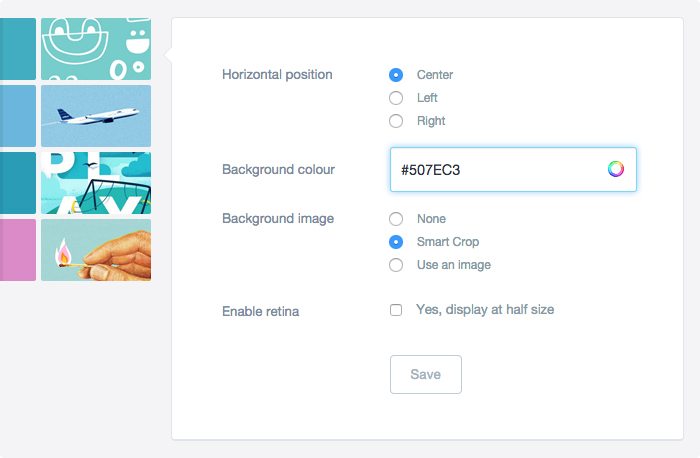
You've always been able to edit the settings for individual images, but until now editing multiple images has been tricky and somewhat limited. That's all changed! Now you'll find bulk image editing functionality under a new tab within your projects. From here you can easily and instantly control the properties for all images in a project — everything from horizontal positioning, to background colours and retina options.
Smart crop for multiple images
"Smart crop" is a feature that automatically continues the background of your image, horizontally, across the browser window — it's especially useful if you're sharing website concepts that have background colours or gradients. This useful (and hotly requested) feature has now been brought to multiple images — it's lightning fast, regardless of how many images are in your project.
A better colour picker
Some subtle improvements have also been made to the background colour picker. When you choose from the colour wheel, auto-detect from your image, or type in a custom HEX value — you'll be given an instant preview of that colour next to your image. This makes choosing the perfect background colour a breeze.
You can also type the names of over 100 colours, like "Red", "White"... or if you're feeling fancy, "Powder Blue", "Medium Aquamarine" or "Blanched Almond"!
Free 10 day trials
Sometimes it's nice to try before you buy — especially if you're unsure whether you'd actually use the additional upload space or team features from a paid subscription. To help win you over, Prevue now offers free 10 day trials — no credit card needed, and no obligation to pay. So if you'd like to give a Studio plan a whirl, start your trial now for an instant upgrade.

Improvements
Sometimes it's the little things that make the big difference. With this release there have been hundreds of tiny improvements that will make using Prevue even better for you and your clients — again, with the theme of making your work look amazing.
Bigger and better thumbnails
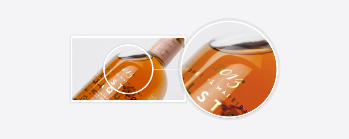
A lot of thought goes into the technology of making thumbnails — after all, they're an important part of showing off your hard work to your clients. A recent update to this code means that your thumbnails are now higher quality, retina enabled, and a much smaller file-size. Check out the level of detail (right) in new thumbnails...
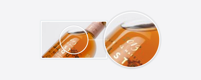
For comparison, here's how they looked before the change...
Retina improvements
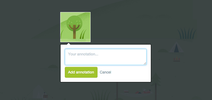
More work has gone into making Prevue retina-enabled, which means that your work remains looking crisp and impressive on newer technology like MacBooks and iPhones. One of the improvements in this area is annotations — which now show retina crops of your images when clients reply to your annotations. These go nicely with the other recent retina tweaks like this and this.
Better fullscreen viewing
By default, fullscreen images were displayed on a dark (charcoal) background — that's no longer the case, with all images now displayed on a white background as default. This change was made in response to an analysis of over 1 million uploads, the outcome of which suggested that the majority of images uploaded (i.e. website concepts) looked best when placed on white.
And on the subject of fullscreen viewing — navigation controls are hidden by default for those of you who choose the 'Fade Out' option in Project Settings. They're then shown as soon as you move your mouse, and hidden again when there's no movement. This is especially useful if you use your left and right arrow keys to navigate through a project.
Responsive homepage
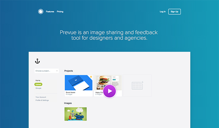
The updates aren't limited to just the app either. The Prevue homepage had a recent design overhaul, and this month has been updated to be fully responsive — which means that log in and sign up are now super easy on mobile devices. Haven't seen the new site? Check it out
Performance tweaks
Almost every release comes with "performance improvements", and this is no exception. For every new feature and visual improvement, extra work happens behind the scenes to make sure that Prevue remains lightning fast for you and your clients. New features should never compromise speed or security — that's why Prevue is now the fastest it's ever been.
Preloading
The most noticeable improvement is that your images display faster in fullscreen mode — this is achieved by loading the next image in a project before you actually get to it. This is all done seamlessly in the background, and only happens after the current image and annotations have finished loading. Coupled with smart content distribution and browser caching, this means that even big images will now load almost instantly.
Pageload speeds
There's nothing worse than waiting for a webpage to load, these days even a couple of seconds can feel like a lifetime. To make sure slow pages are a thing of the past, a number of tweaks have been made that have improved load speeds by an average of 200ms across the entire app. For the nerds, this has been achieved by reducing server memory, smarter caching of assets, and installing several new content distribution (CDN) routes that serve site assets in parallel.
Service status
Prevue was recently hit by a DDoS attack, which last month caused several outages to the service (read more). Though significant measures were put in place at the time, the attacks continued with no sign of stopping. After further investigation, the source of these attacks was traced to China — and as such, all inbound traffic from Chinese IP's is now being blocked. Though a regrettable last resort, this has returned Prevue to sustained 99.99% uptime for everyone else.
Small fixes
And finally, there have been fixes to a few annoying quirks and bugs that have been reported. Though none of them significant, they all represent improvement to the overall user experience of the app.
Writing annotations
After your clients drew an annotated area, they were required to click into the annotation field to write their message — that extra click was just annoying. Now the annotation input field is highlighted as default, which means you can start typing as soon as you've drawn an area. You wouldn't think it was too annoying, but after writing 10 annotations you'd definitely notice the improvement.
Vertical alignment fix
The custom vertical alignment was being over-ridden for images wider than 1200px. This has been fixed, and all images can be aligned no matter what their dimension.
Losing the sharing popup
After navigating to a newly created project, you were immediately shown the "Share this project" popup. That wasn't particularly helpful, so has been removed. Don't worry, you can still access all sharing functionality from within 'Settings & Share'.
New keyboard control
When you view an individual image from your Library, you can now hit the ESC key on your keyboard to return to the Library. Similarly hitting ESC in a project image will return you to the project overview screen, left will take you back one image, and right will take you to the next... great for presenting!

What's next?
There are a host of big improvements on the horizon, but the next item on the list is better bulk image replacement. This will give you the ability to replace all images in a project at once, simply by dragging and dropping new versions from your computer.
If you have suggestions or requests of your own, don't hesitate to get in touch via Twitter or email
James